Post

2 followers Follow
0
Avatar

Make my ONTRApages mobile responsive

Rochelle Yoshida

Sometimes words break into two lines on my ONTRApages when I view them on my mobile phone. How can I fix that?

Answered

Official comment

Avatar

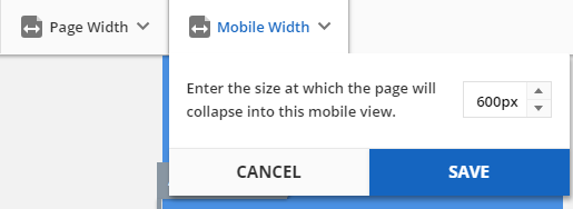
We have a new feature for ONTRApages that will help for mobile clients ... you can now edit the font, font face, font size, line spacing and the background padding for the mobile version using the "Mobile Display View" button in the editor. The same function now exists in ONTRAmail as well.

Details for ONTRApages at: https://support.ontraport.com/hc/en-us/articles/115008384948-Editing-Content-in-ONTRApages-Blocks (in the "Edit Mobile Fonts and Backgrounds" section)

For ONTRAmail, see https://support.ontraport.com/hc/en-us/articles/217882588#mobile-view

Rochelle Yoshida
Comment actions Permalink

Please to leave a comment.

3 comments

0
Avatar

We have also just updated our order forms to be mobile responsive!

Rochelle Yoshida 0 votes
Comment actions Permalink
0
Avatar

Now you can also set the mobile view breakpoint - the pixel width where the elements will stack responsively instead of resizing on the screen. In Mobile View choose the Mobile Width drop down and edit the width from the default of 600px up to 1920px. 

Frank Hagan 0 votes
Comment actions Permalink