Official comment

Just click the main menu item, Partners, to see the partners in your partner programs. You can manage them from there: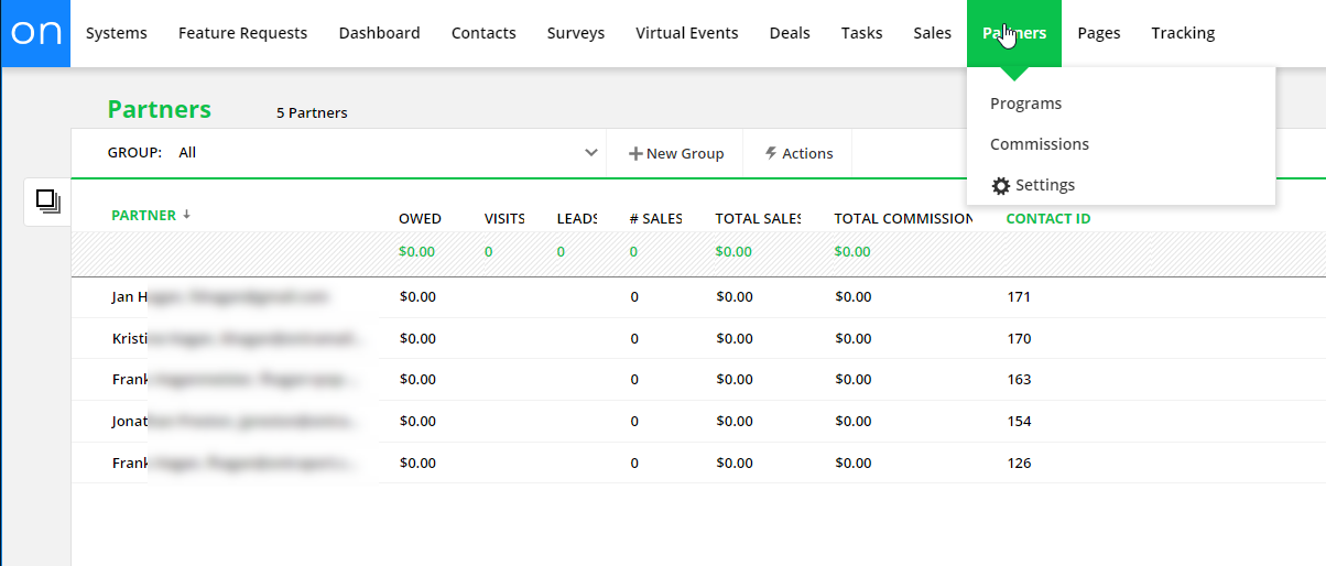
Comment actions

I am brand new to Ontraport, but while seeing OP is super powerful, I'm also finding that it is very confusing for a variety of reasons.
First, many of the menu names and terminology don't mean what they actual do. For example, the "Partners" page - Anyone new to OP would expect that you could view and manage partners here -- but you can't You can only manage partner programs here. So why confuse customers? What you really mean is "partner programs" - or add the the remaining functionality to manage partners from the partners screen.
Another example is "Actions" that opens a menu at the very top of the screen that you don't notice. I get this is a kind of a material view but the way its implemented makes is confusing.
The experience should be natural, fluid, easy to use. The odd naming and positioning of menu is not this. The experience feels like you have to go to the bootcamp to understand OntraPort.
So my point is if you want businesses to thrive and use more OP services, say what you mean and streamline the process.
Just click the main menu item, Partners, to see the partners in your partner programs. You can manage them from there:
Please sign in to leave a comment.
Hi Derek! We released "customize your navigation by role," where you can show/hide navigation items for specific roles (for Enterprise accounts). This could help solve one of your pain points regarding account organization. Learn more about it in this article: https://ontraport.com/support/reference-material/ontraport-navigation/