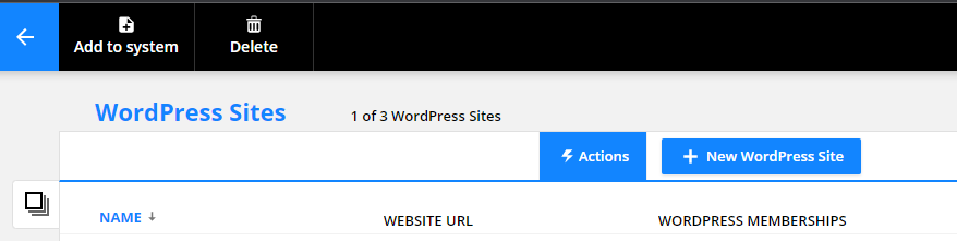
Additionally, in some places - items are found in different places. Delete within the Programs details ( right at the top) could be catastrophic if accidentally deleted. 
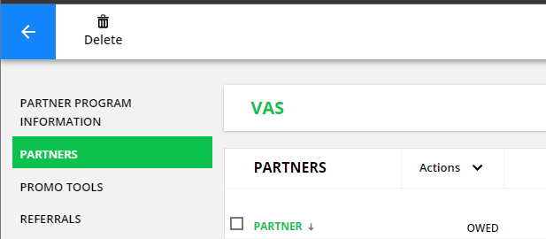
While in products, I can't delete the product while viewing the product detail.
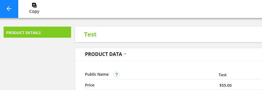
I have to go back a step and delete it there.... which is more secure and makes sense.
Again - every section of OP has a different way of doing it. Very frustrating.
We're trying to use OP into standard the B2B world and it's been frustrating with its odd terminology and inconsistent UI. If OP is going a UI style guide, it's just missing standardization of the user-system interaction. Terminology is a business thing.
Post
FollowFix product interface inconsistencies....
I'm finding your interface very difficult to use, mainly because menus are all over the place. For example, "Actions" in the Partner program area is a dropdown,
while in other places it's in header....
I've seen this with Save functionality as well.
Can I request that we provide a consistent UI to your customers so as to limit our confusion and know where to look for options.
Personally, I find the actions in the header super non-intuitive. We've been trained forever to look for sub-menus and actions within or under what we click, not above.
Thanks,
-D
Please sign in to leave a comment.
5 comments
Hm, not sure I can agree with you on this. Actually, the menu functionality is the same everywhere in the app.
You're pointing at two different things and wanting them the work the same way, but they can't.
The first is actions against a collection of items. They can't be listed 'under what you click' because 'what you click' is a bunch of checkboxes all down the page. The actions act against all selected items, so up top makes good sense.
The second is actions available to a SUB-collection of items. Similarly, you might select more than one item, which is why they're at the top of the subcollection. But they can't be at the top of the page, because you commonly will have multiple subcollections on the same page.
This UI pattern is used consistently throughout the app.
Landon - I would disagree. Collections and sub-collections are irrelevant as a user. Separate OP-specific architectural design/implementation from the user interaction. You don't need to know how an MS Word or Excel document is stored to use it. Google Ads has a business hierarchy but that's not how they store it underneath.
A new user isn't going to know OP specifics of collections of collections of collections. Sure it's natural to anyone who has used it for years, but not for newcomers who are looking for business functionality first.
Not sure what there is to disagree about: You said it's done differently all over the app, but that's not accurate. It's consistent all over the app. We know that to be true, because those are all the same component, used everywhere.
Your example is a good one: in order to delete a bunch of rows from excel, you select the rows and then go to the top and select edit > delete. Same pattern here. Sure, there are hotkeys or right-click menus in excel, but the basic pattern is the same.
Are you asking for right-click menus? That could be cool.
Hi! We've added lots of functionality to our partner program with our latest feature release and thought you might be interested. Here's some info about it:
It’s a new era of partner management – with partner data available app-wide!
There’s a new way to view and manage your partner data that makes it easier to deliver the engaging custom experiences you want. You and your team can now access referred contacts, commissions and open orders in contact records, allowing you to use this data in pages and with Dynamic CMS.
That means you can say goodbye to managing your partner center in WordPress! Now you can build a powerful, unified partner center with an Ontraport membership site. Save time and resources by managing all your partner data in one place!
You’ll love:
- Easily accessing metrics such as what you owe partners and total commissions
- Creating groups of top performers or partners who need support
- Tracking referrals in real time
- Building a beautifully designed partner center
And your partners will love:
- Using only one login and password
- Engaging with live leaderboards that fuel competition
- Receiving automated rewards and recognition for hitting milestones
- Creating their own custom partner profile page to display the data they need
Partner programs are available for Pro plans and above. Dynamic CMS is required for creating dynamic partner centers.
Learn more in our Support Center article: ontraport.com/support/partner-programs/create-a-partner-center